Boredom Busters Branding & Art Direction
Client: Nestlé Clusters
Agency: McCann Athens © 2018
Creative Direction: Eleftheria Petropoulou/Effie Bambos/Maria Kozari Mela
Copywriting: Yota Mazioti/Eleftheria Petropoulou
Design - Art Direction: Maria Kozari Mela
We were asked to create a digital video and the visual identity for Clusters, promoting a phygital activation named Boredom Busters.
You can watch the digital video here.
Disclaimer: I do not claim ownership of the Nestlé Clusters logo used in these designs. Copyrights and/or trademarks used belong to their respective owners and are not being sold.
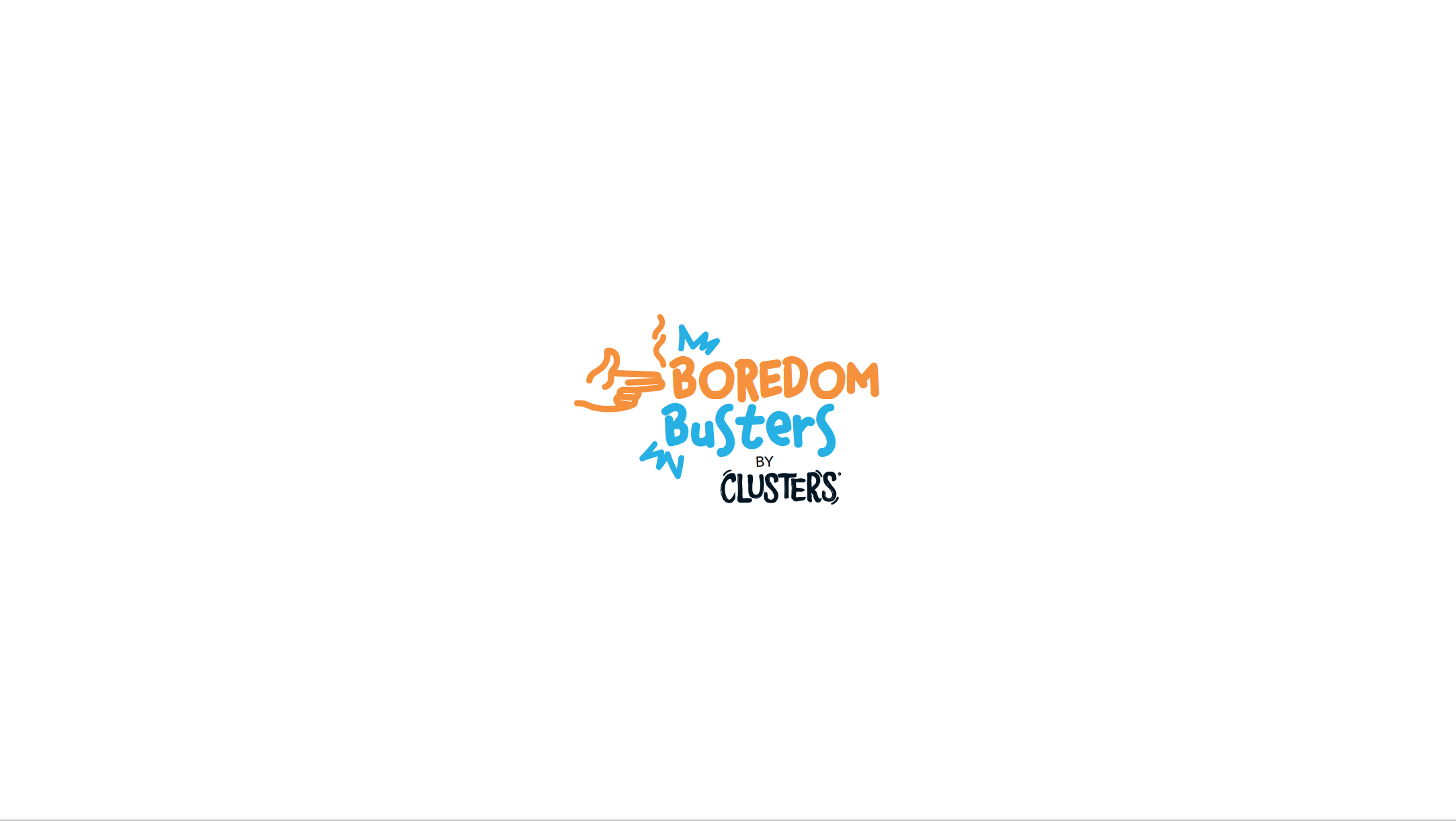
According to a poll regarding boring activities, the top result was that men are bored when asked to go shopping with their significant others. The Boredom Busters concept is quite obvious: Clusters are the solution to boredom. We were asked to design a logo/key visual for this activation that reflects Boredom Busters and communicates the concept visually.
The target audience for this activation were male consumers aged 20-40. The design practice behind the logo proposals ranges from a dynamic approach using strong typography and symbols such as a flaming punch that defeats boredom,a hand that resembles a gun shot that exterminates boredom and a more typographic one that uses the X symbol that cancels boredom. I used the cereals' packaging colors in the color palette in order to create a strong sense of brand alignment.


